File download is hosted on Megaupload
I really dislike the concept of branding. In particular, I dislike the idea that brands have value and that there is a responsibility to the value inherent in a brand particularly in the humanities. Over the past few years, I’ve been confronted by a number of individuals who view the brand as major part of their responsibility toward public humanities institutions. To my mind, the investment in the brand – whether financial, intellectual, strategic, or emotional – has produced a kind of conservatism. While I’d never suggest that these individuals valued the brand above content, there is a tendency to use the concept of the brand and its definitions as a way to create barriers to collaboration or even prioritize risk taking because, in the end, social and historical capital that has accumulated around the brand matters.
At the same time, as I take on the role of editor of North Dakota Quarterly and sit in an office surrounded by 85 years of the journal and am incredibly aware of the history and legacy of the publication. As we move from being self published to being published by University of Nebraska Press, we have a chance to refresh our cover and interior design. I intentionally asked that we try to evoke some of the design elements during the Quarterly’s heyday under Bob Lewis in the late-1990s and early-21st century. (This is a nice example of it). Despite liking some of our more adventurous approaches to layout – including columns and a volume designed “Tête-bêche” – I got into my head that a more consistent approach might make the journal easier to understand and consume… in other words, ugh, branding.

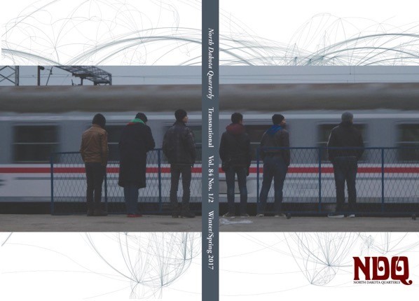
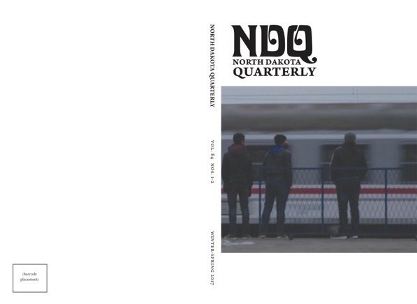
I also really liked the cover of our recent issue (84.1/2) dedicated to Transnationalism with it’s full width image and was pleased that UNP looked at that cover as a possible template for future NDQs. We need to find a cover image that has the same appeal as Marc-Antoine Frébutte’s “Waiting for the Train,” but I think that’s possible. UNP also played a bit with the NDQ logo while keeping its iconic Davida font. Here’s one example of what they’ve shared:

Before I knew it, I was thinking about BRANDING and what was important to preserve in NDQ’s identity so that our readers and contributors recognize that despite the changes, we are going to maintain as much of the traditional NDQ identity as possible. I still don’t like branding or the idea of investing in the brand, but I suppose in this case it has a function of reassuring our audience that the core values of the Quarterly will remain intact.
I still hate branding, though.


